I visited the exhibit with my dad in November:
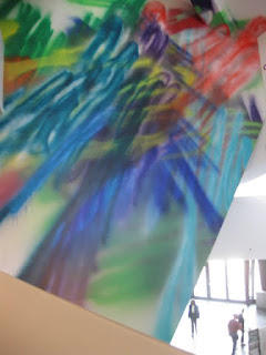
John McEnroe's suspended nylon forms The Bathers and Katharina Grosse's painting George (above and below.)
Vertigo: part of Katherina Grosse's piece on the Left, and Jessica Stockholder on the right. Stockholder's atrium element is connected to a larger installation in the second floor galleries (below) by an extra long orange extension cord as if it's a battery or solar power source.
Dasha Shishkin's Dying Christ Rushed to the Hospital.
Tobias' Rehberger's Bert Hölldobler and Edward O. Wilson in the rain is a fun piece that evokes a Chuck E. Cheese bungee cord paradise which is nicely integrated into the second floor of the atrium
The atrium is lined on all levels with works that are seen in relation to one another. This can be interesting, but it can also proffer the sense of an art fair on a vertical axis.
Additionly, a small area in the second floor galleries is dedicated to photographic documentation of the installation process of the various works would be (and is) a nice informative feature for the exhibition website, but its presentation in the gallery has a compromising effect on the exhibit.
How an installation is made can be interesting, but to draw attention to that aspect of the work while in the midst of it misses the mark entirely, threatening to reduce an exhibit to a collection of peculiar novelties.
I recommend checking out the exhibition page on the museum's website for loads of pics and other info on all the works in the show.
El Anatsui's work Rain Has No Father? is installed in one of the small side galleries that houses a selection of African artifacts. It's logical, the artist being African, that his work would be contextualized among African tribal artifacts, but given the dinky, uncomfortable nature of the space, the choice of installation placement comes off seeming marginalized, obvious and perhaps a bit racist to me.
Kristen Baker's Dihedral Barrage holds a place of honor on the fourth floor.
The spirit behind the exhibit is honorable. It's a worthy effort in addressing a museum space that by its nature longs for a permanent Tino Sehgal installation.
As we exited the Liebeskind designed Hamilton building via the passageway that crosses over Thirteenth Ave to the original Ponti building, we passed, a young boy standing at the threshold to the Hamilton shouting to his father inside the Liebeskind space, "I don't want to go in there." Out of the mouths of babes...


No comments:
Post a Comment