Sunday, May 20, 2007

Skin Trade opens at Go North on June 2

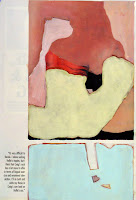
Genesis 10, 2007 acrylic, oil on paper


My exhibit of new small works will be opening in two weeks at Go North, at 469 Main St. in Beacon, NY. The exhibit will consist of around thirty small oil works on paper.
Born out of some responses to work that I've been doing examining the nature of "skin," or that which takes up the role of skin .....I began painting on pages from adult magazines. Grafting the skin of a paint film over the exposed skin in the magazine photos, I began finding rather beautiful compositional elements within the images. I found a type of layout particularly intriguing. This layout entailed two images, often of the same size arranged vertically with a small margin between the images and to one side. The margin on the other side is wider, and holds a narrative text relating to the images. After obscuring the photographs, creating new images that often take the form of abstract landscapes, the presence of the text took on a hightened sense of farcity. Divorced from the images it originally served to describe, the text now serves as a piece of pointed absurd poetry. The resulting pairing of text and image provides a serving of crass literature that imposes itself in one's thoughts along with a non objective plane of contemplation suitable for cleansing the mind.
So are you contemplating the beauty of the image inspite of the words you've just read, or are you searching the abstract image for clues to illustrate the prose, or does that swatch of color give space for you to reflect on the words, unfettered by someone else's version of the visual.
Here's the press release for the show:

For Immediate
Release:
Christopher Albert: Skin Trade
June
2nd – July 1st, 2007
Opening Reception: Saturday, June 2ndth, 6 –
9pm.

GO NORTH is pleased to present the opening of
Christopher Albert’s exhibition “Skin Trade”. The work will be on exhibit from
June 2nd through July 1st, 2007. A reception for the artist will be held on
Saturday, June 2nd, from 6 - 9 pm.
Christopher Albert’s new paintings
use images from pornographic magazines as the underlying structure for the
formal elements of his paintings. Painting on top of the images, he transforms
the graphic sexual images into a sensual blend of colors, forms textures, and
lines. Leaving behind small traces of the original source material and the text
associated with the sexual act. Literally and metaphorically “trading” the
visual pleasures associated with porn for the visual gratifications of painting.

Founded in September of 2006 by artists Gregory Slick and Karlos
Cárcamo, Go North’s mission is to support, exhibit, and promote art by local,
national, and international artists. Our focus is contemporary art that is
dedicated to exploring cutting edge cultural and artistic issues by pushing the
boundaries of traditional media. Staging monthly exhibitions on a rotating basis
gives artists the opportunity to expand and explore new dimensions in their
work. Enabling us to keep our exhibitions fresh and updated, while providing a
place in the Hudson Valley for contemplation, dialog and exchange of ideas.

GO NORTH - A Space for Contemporary Art
469 Main St., Beacon,
NY 12508
gonorthgallery@hotmail.com
www.gonorthgallery.blogspot.com
Gallery hours: 12 - 6
pm, Friday - Sunday

Sunday, May 06, 2007

In the belly of the beast

I took advantage of some free time on Saturday to visit the new Libeskind addition to the Denver Art Museum.
It's been a pleasure stopping by from time to time, to check in on the progress of the construction of the building, as the skeletal structure of the extension stood on its own as sculpture.

The exterior of the new Hamilton wing is dynamic, and the exterior public space created by this building in relation to the Central Public Library and Gio Ponti's original museum building is extraordinary. The exterior composition of Libeskind's building and the manner it sits in its environment, represent the best element of the building, but it also signifies the greatest failing of the edifice. This is obviously a structure designed from the outside in, with the resulting pressures bearing heavily upon the shoulders of artwork and visitor contained in the spaces within.

After the assertive, powerful elements looming overhead outside, I was considerably underwhelmed by the lobby which felt unnecessarily heavy, dark and contractor grade. The high point of the effect that the pushing and pulling of the structure's skin has on the interior is the dizzying sensation of vertigo one gets as one looks down at the staircase from the third and fourth floors. It's down right Hitchcockian. It's also the singular saving grace on the interior of the building.
As the Hamilton Wing was opening last fall, The Denver Post's Kyle Macmillan wrote an article with the head line "As Art and as a home for art, it succeeds" As architecture as sculpture, I think it does work, but as a home for art, it certainly doesn't. Art doesn't own this home, it's simply renting. There are so many expansion joints, shadow lines, and compromised installation choices that the effect of the space is actively competing with the artwork. At virtually every turn, the building elbows into one's field of vision, vying for attention saying "Yeah, that Motherwell is ok, but Motherwell and Libeskind, now THAT's a combination." In a recent interview on Colorado Public Radio, DAM Director Lewis Sharp spins the performance of Libeskind's design, saying that the building is anything but neutral. True. Unfortunately this non neutrality does little more than neuter the the very work it was meant to showcase.

There's much to riff on like the odd auxiliary galleries housing some Oceanic and African artifacts located off of the main contemporary galleries which are very obviously unintentional spaces resulting from the building's structure that had to be filled. More afterthought than curatorial intention, these spaces do nothing but add to the adhoc sensation presented as one moves through the galleries.
The selection and placement of work throughout the modern/contemporary galleries is a perfunctory survey through time. Perhaps bowing to the years of bellyaching of local artists that there has been no homegrown contemporary work on exhibit, there are a couple of hometown artists displayed among other work in the collection. A boon to Phil Bender is the placement of one of his arrangement of hubcaps among the Irwin, Judd, and Lewitt pieces. Bender's piece stands out for me as one that perhaps shows an affinity of spirit with these other notable artists, but his presence here feels more like the little brother out on the baseball field only because the older kids are one shy of fielding a full team.

The Anshutz Gallery on the Second floor which is just about the only area in the building with plumb walls. The current exhibit is Radar, selections from the collection of Vicki and Kent Logan. It's reaffirming to be moving through a space with right angles. The drawback in this space for me are the free standing walls that, given the polygonal footprint of the gallery are arrayed in a series of almost parallel partitions that create shallow funnels that at the bottom of which create a log jam of art and audience.

What surprised me most about moving about the new extension was the completely subconscious sense of relief and unburdening that I felt as I traversed the second floor footbridge into the original Ponti designed North building. The first floor of the Ponti building felt like a neglected ghost town, which I imagine will change, and non too soon, for I feel that this it where the soul of the museum still rests.
I'm looking forward to seeing how the curatorial staff will rise to the considerable challenge of learning how to install work in the Libeskind space that hits. It's not impossible for this to happen, however, the potential for it happening might be limited by the political understanding of what the public was paying for when the addition was approved, because the best use of this building may well be contrary to how the building's use was originally pitched.

Friday, May 04, 2007

Expressionistic Graffiti Abatement - 13th & Steele, Denver

I've been in Denver for a few weeks for work. I tend to notice attempts at obscuring graffiti far more than I notice the actual graffiti. This is a particularly beautiful example that caught my eye.