Thursday, March 30, 2006

DAM addition, and the Clyfford Still Museum site

On Sunday March 19, I headed down to my old neighborhood to photograph the current state of the Daniel Libeskind addition to the Denver Art Museum. As I stated in the previous post, over the past couple of years, I managed not to have my camera on hand to photograph. Seeing the progress of this building as I've returned periodically has been fascinating. The time when the skeletal structure was being constructed was the most striking period, and one when I wish I had snapped some images. The array girders and beams, each one unique and set on extreme on an extreme angle looked like the giant spawn of the smaller DiSuvero piece in the adjacent plaza. Such is the nature of the bones of this building, that at the time I felt disapointmented that the structure would need to be sheathed. The building is dramatic as it reaches over 13th, toward the exsisiting DAM tower designed by Gio Ponti. I was sceptical of this plan when the drawings were first released, but upon seeing a model of the building at a presentation Libeskind held for neighborhood residents, I saw that, in relation to the exsisting museum, and the Micheal Graves designed Library, the new addition could create a dynamic, and surpising presence that would further unite the other two structures.

Michael Paglia of Westword has written extensively and insightfully on the progress of the building over the years. If you're interested, I suggest doing a search in his archived articles for more on the development of the building. I understand the Fredric C.Hamilton building is scheduled for completion in the coming fall.
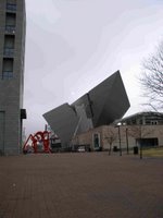

View from the North. Denver Public Library on the left, the Museum Cafe and entrance in foreground right.


Close up view with Mark DiSuvero's Lao Tzu.


View from East on 13th Ave


View from East

View from South. Though less dramatic than the north elevation, I think this is my favorite viewpoint of the museum.
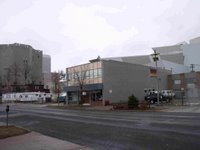

Two Views of the location chosen for the Clyfford Still Museum:


The Gio Ponti designed portion of the DAM is on the far left side, with the new Libeskind addition in the background and right. In the Foreground are (I believe) the three parcels that are to be claimed for the Still Museum. On the left is a parking lot currently being used for DAM construction. In the center, an office building, and on the right, set back from the street is a minisitry organization.


Monday, March 27, 2006

Third Friday in Denver

I have made a point of making sure I have my camera with me as I head around Denver. On several occasions over the past couple of years, I have wanted to photograph the various stages of progress on the new wing of the Denver Art Museum, but simply never did. Alas, I did manage to head downtown last Sunday morning, camera in hand and took several images of the addition, which is set to officially open in the fall. I will be posting those images as soon as possible.

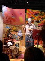
Photographs, video by Emily Von Swearingen

Narrative projection by Emily Von Swearingen


Poetry, photo installation by Jake Adam York

On the previous Friday, March 17, I went over to an opening for "Between Words" an exhibit of photographs, and projections by Emily Von Swearingen and poetry by Jake Adam York at Ironton Studios. Ironton is located north and east of downtown, and it is a part of the newly branded arts district called RiNo. Still predominantly an industrial area, there have been various studios, and galleries migrating here for a couple of years.


I left Ironton, to catch an event at El Museo de Las Americas on Santa Fe. On the third Friday of each month during the current exhibit, "Never Leaving Aztlan," the museum hosts Lucha Libre. Meant to be a debate between two artists in a cage match atmosphere, the evening is divided into five "rounds" that allow the participants to discuss and show their own work, and field questions from the emcee and the audience on topics related to art, culture, and ethnicity. The concept of the series is good, and could prove to be entertaining and engaging. In practice, however, the participants of this evening were neither entertaining, engaging, or enlightening. This is really a performance, and for it to work, the participants must be prepared to perform. Instead they were a bit awkward, which could be understandable, but they could not stay on topic or keep their orations short. The evening was a bit painful, and even more boring. I was intrigued by the event, as it sounded somewhat similar to an idea I have been mulling over for a while back in Beacon. Sort of a friday night fights, pitting artists against one another with the prize being an exhibit of some form. Kind of like a match of creative King of the Hill. I left at the beginning of the fifth and final round, and headed up to the Highlands to check out the offerings at EDGE, and Pirate.

EDGE benefit exhibit

EDGE was presenting expressionistic abstract collage paintings by Susan Berkley in the first room, a benefit auction in the second room, and an airy installation of eggshells labled with text relating to entities of main stream culture by Hans Wolfe in the back room.


Sometime last fall, Pirate had contracted spatially, and donned a new store front entrance. Since then, an new coop called Next has opened on the corner, occupying space relinquished by Pirate. The face lift of the building lacks the edgy character it once had, and though not fully gentrified in appearance, it feels a bit tamed now. Pirate seemed to be having an opening that night, although it was somewhat quiet compared to past openings. Next door at Next, it seemed there was an open entry, or juried show that felt completely random. My impression was that this was their first or second show, and in the spirit of a housewarming they opened the door for participation to anyone who chose to do so. Fortunately, EDGE still carries its perpetual solid look of an indifferent fortress across the street from its neutered neighbors. The drawback to EDGE's appearance is that to the untrained eye, it can be difficult to discern whether it is open or not.

The first Friday of the month is the night that carries the most punch, currently, with crowded openings in the galleries lining Santa Fe Blvd. The crowd here is large, and young, and it's a definite scene. The Santa Fe district has been in assention since the late 90's whenI had my studio in the neighboring Golden Triangle district and they were just beginning to get organized. Since then a number of galleries and some studios have moved in, including Core and Spark, two long running co-ops that have moved in together in the space vacated some two years ago by Fresh Art. Being that it was not the first, but the third friday, there was not much going on save the match of wills over at the museo. The Santa Fe scene is definitely a big draw and it has diverted some attention from the likes of EDGE and Pirate which have been in their present location for a very long time now and are a bit like the old men on the hill. The challenge for Pirate, EDGE, along with Next, Zip 37, and the neighboring Bug theater is to convey a fresh currency when other young trendy scenes continue popping up in different parts of town.

Saturday, March 25, 2006

There were snakes on the plains before the plane was even invented


Early last week,
Monkey Angel Studios' film, Hannah House was released on DVD in the UK. It's available for sale or rent at retailers and online. Information on the UK release can be found at Hannahhousethemovie.co.uk

This image above is the cover for the DVD. The tagline the distrubutor (MAAD UK) came up with is excellent.... "They came for the prairie life... The got the afterlife."

So far, I have only seen 2 reviews. One really good, the other really bad. I have to say that the bad review mentioned the image quality of the film was bad. I think he missed the point altogether as the look of the film was intentional.

Anyway, since I've been in Denver, we've been getting together, making plans for the next MA film, Red Raccoon. Hannah House was altogether cooky, but Red Raccoon will be down right and singularly unique. (Unique=Bizarre) My role here is dealing with the art direction, working with folks from the Monkey Angel Collective and beyond, shaping the look of this film by merging the signature visions of all involved. I'll be posting info in the coming months on some of the progress, and info on the artists involved with the production.

Saturday, March 18, 2006

Strange Turns


At the end of last year, I posted a remembrance of Chris Whitley. He has been a favorite musician of mine since I first heard "Living with the Law." Since his death, I have thought often of his progression as an artist, and that arc of exploration cut short too quickly, and it has resonated inside my head, urging me to be sure to be engaged in the present, and while striving and sacrificing for some distant goal to respect, and relish where I am currently.

Life is full of those uncanny occurrences that knock you on your butt and the only way to explain it is to say "that's life." One such occurrence is that fact that one of Angelika's photographs is on the cover of the North American version of Whitley's last CD, "Reiter In." There are a couple of other images by Angelika in the CD packaging as well as a cool photo of Chris on stage by Bill Ellison. It's just so odd. Every so often, as I'm listening to his music, it just strikes me-the shame of such a unique talent now gone..

We went to a tribute to Whitley in NYC several weeks back, and it was wonderful to see and hear from folks whom Chris Whitley had influenced, and impacted. We unfortunately had to leave early before hearing his brother Dan's band, but I was able to see Chris' dad take the stage to speak a bit, and play a song. That was one very affecting moment, and one filled with a dignified and graceful poignancy.

Thursday, March 16, 2006

HVCCA

At the end of last year, I was invited to join the Board of Advisors for The Hudson Valley Center for Contemporary Art in Peekskill NY. The advisory board is made up of 24 people of from various disciplines from law, business, and art, with various skill sets and spheres of influence. These people will be working in different capacities to help grow the museum, and further its mission.

I'm gratified to have been considered for participation, and I am excited to be working with such a dynamic group of people for an institution that is bringing exciting, relevant, world class contemporary art of a to the Hudson Valley.

Peekskill is 20 miles south of Beacon. 20 miles that at on point felt like a two hour trek in the shifting perception I felt when we first moved to Beacon. I have on several occasions driven 6 hours from Denver to Santa Fe and back in the same day to visit Site Santa Fe. But there is something of the compression of time distance and effort that makes comparatively much shorter journeys feel equally long. Much of it has to do with the terrain, and the more circuitous routes of the roads. There is a funny isolation that occurs among art communities within the various cities and towns of the Hudson Valley. It's akin, I imagine to the historically long isolation of villages of the Swiss Alps divided by mountains and valleys, but very near to one another in proximity, each on developing its own special dialect of the language. I am trying to make a point to get out to other communities and see what's going on.

The truth is that Peekskill is less than a half hour from Beacon, and it is an hour from NYC on the train, so it is accessible, and there are some great exhibitions, and programs being offered at HVCCA that can benefit the entire regional creative community. ...And at a price that is really affordable. Admission is $5 and a membership is only $25, which I didn't realize when we started going otherwise I would have joined much sooner, and it would have already paid for itself.

Wednesday, March 15, 2006

On the road, and the last 2 weeks in review

I'm currently in Denver, working on some decorative projects, and making plans for an exchange exhibit in June between artists working in Beacon NY, and the artists of Edge Gallery here in Denver.

The past two weeks had me running. I was involved with an installation of an exhibition at the International Center of Photography, that felt like a marathon. We finally finished at 4 am last Thursday morning. Just in time to give me a little rest and prepare for the open studio at Spire on Saturday. I managed to take a few photos, and i will try to post them tonight.

On March 3, we held a reception hosted by CPA, Deborah Bailey Browne at her office. This is an ongoing partnership I'm calling the "Curated Office" that presents contemporary artwork in a setting, and before an audience that allows an opportunity to access, and relate to the work in a way that the rarified environment of the gallery doesn't necessarily allow.
The response to the work was very receptive. Each time I organize these mini exhibits allows me to change up the way that people interact in the space given the influence of the artwork present. I want to gently push the envelope with the type of work that can function, and seemlessly exsist with such a particular setting.
This current installation features a few of my pieces along with the work of Simon Draper, Marnie Hillsley, Matt Kinney and Alexis Elton.Most of the work represented a personal relationship with material. Simon and Marnie both create wall hung constructions of wood. Matt's pieces represent his working with acrylic paint on paper in a way that ceases to be acrylic paint and could easily be something else. Alexis' work with bubble wrap, and oil stained cardboard represents the the greatest leap of material in the show, but I think I was able to show the beauty, and grace of her choices. This is an editorial view on my part, but I think it helps add a potential new context to her work. Alexis did say that it took some getting used to seeing her own work in this environment, and it was freaking her out a little --but I think it was in a good way. The work I put in was the most traditional in a sense that it was straight oil or acrylic on canvas, and although it might be abstract, it was the most conventionally made work.

I think this a great opportunity for members of the artistic and business communities to mix and find commonalities, and I'm grateful to DBB for supporting this effort with as much of her own effort as she does.